2022
PROJECT: Cross-Platform Political Advocate App ROLE: Concept, Research, Visuals DURATION: 3 weeks
PROJECT VISION
Thinking strategically about this project for social good, I had a two-phased approach. First, design a mobile app first to address the problem and test the low-fi mock-ups with end users in a moderated usability study. Second, design a complementary responsive website to enhance usability on a larger screen or device and test the final design with end users in an unmoderated usability study.
CHALLENGES
1. Identify the biggest barriers to election registration
2. Understand the process of applying for and participating in a local campaign
3. De-mystify the journey to apply, and to make running for local office more accessible to all
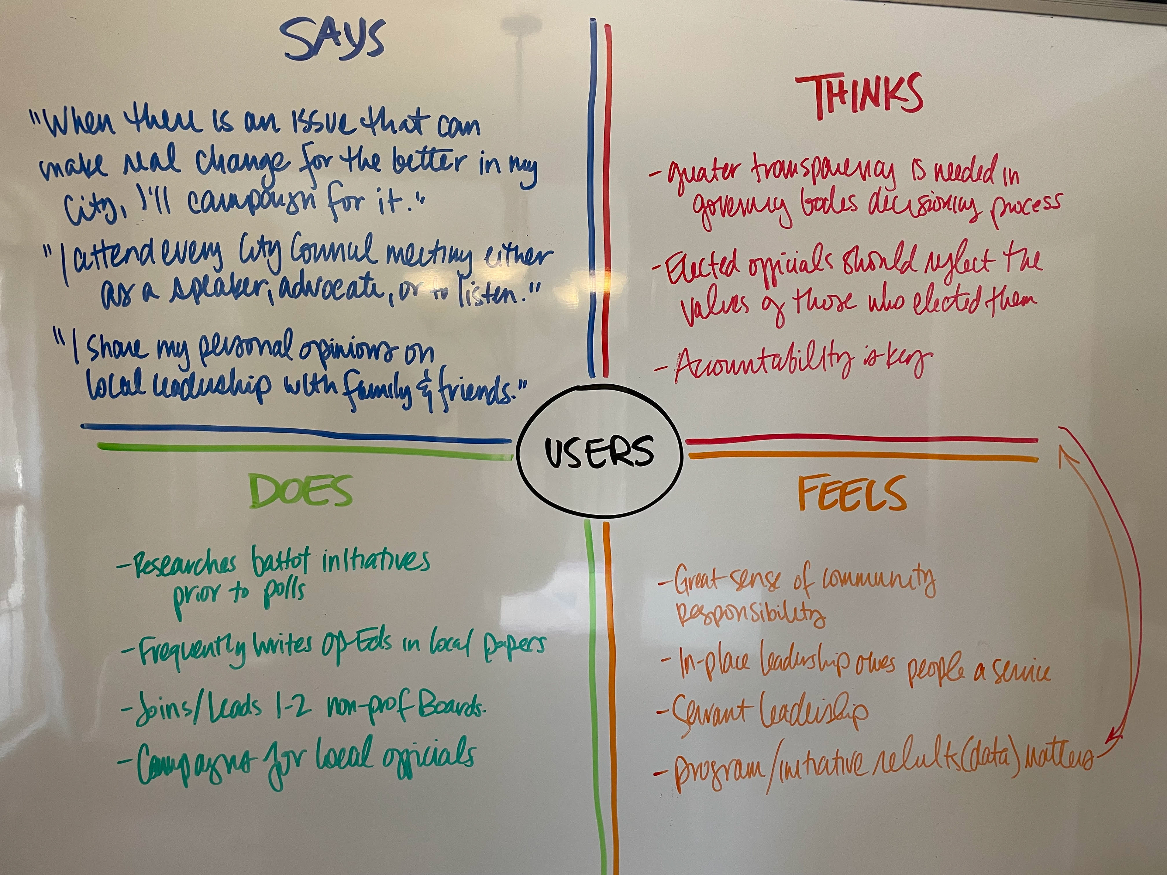
Aggregated Empathy Map
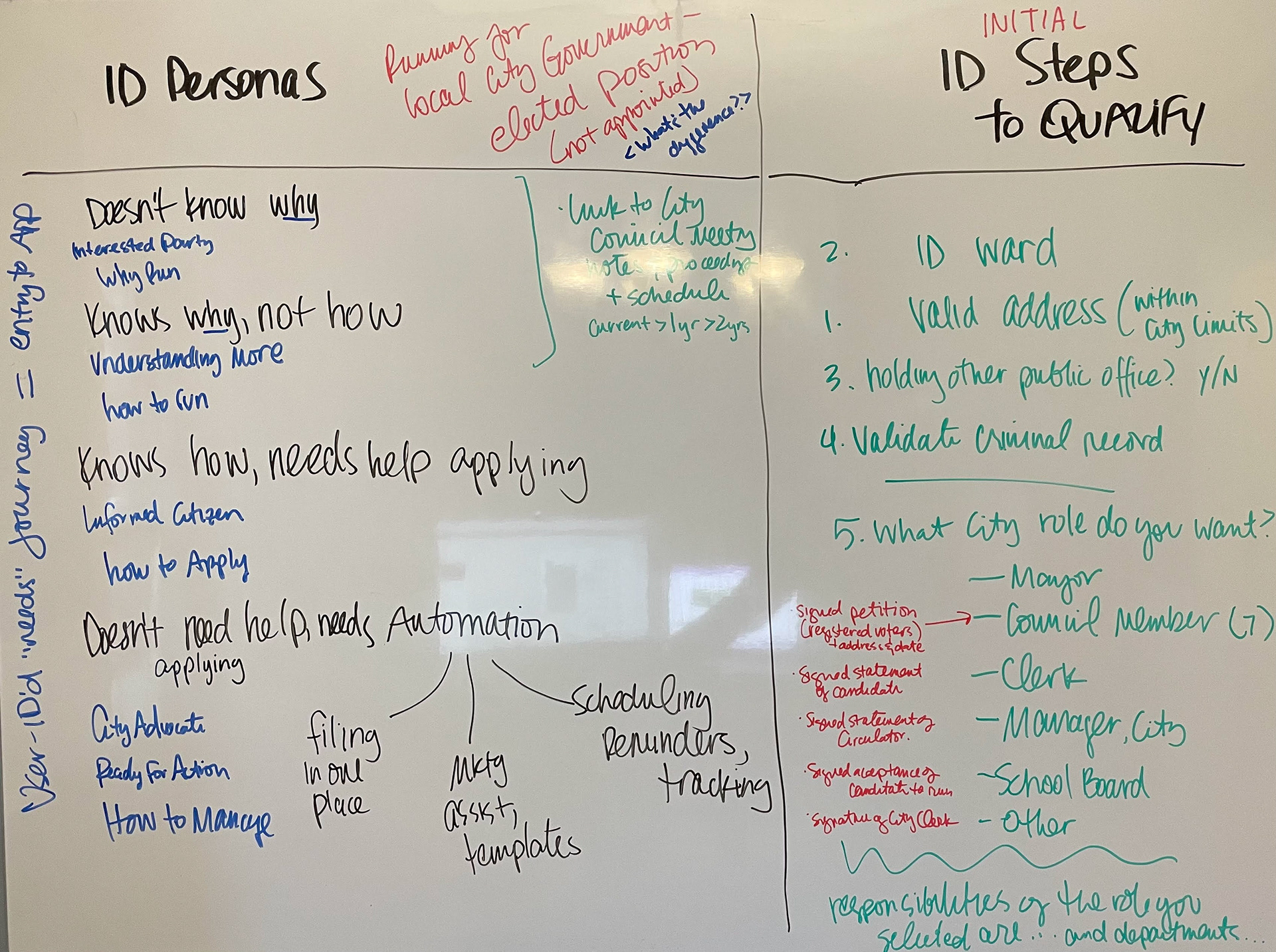
User Journey and Process Mapping Exercise
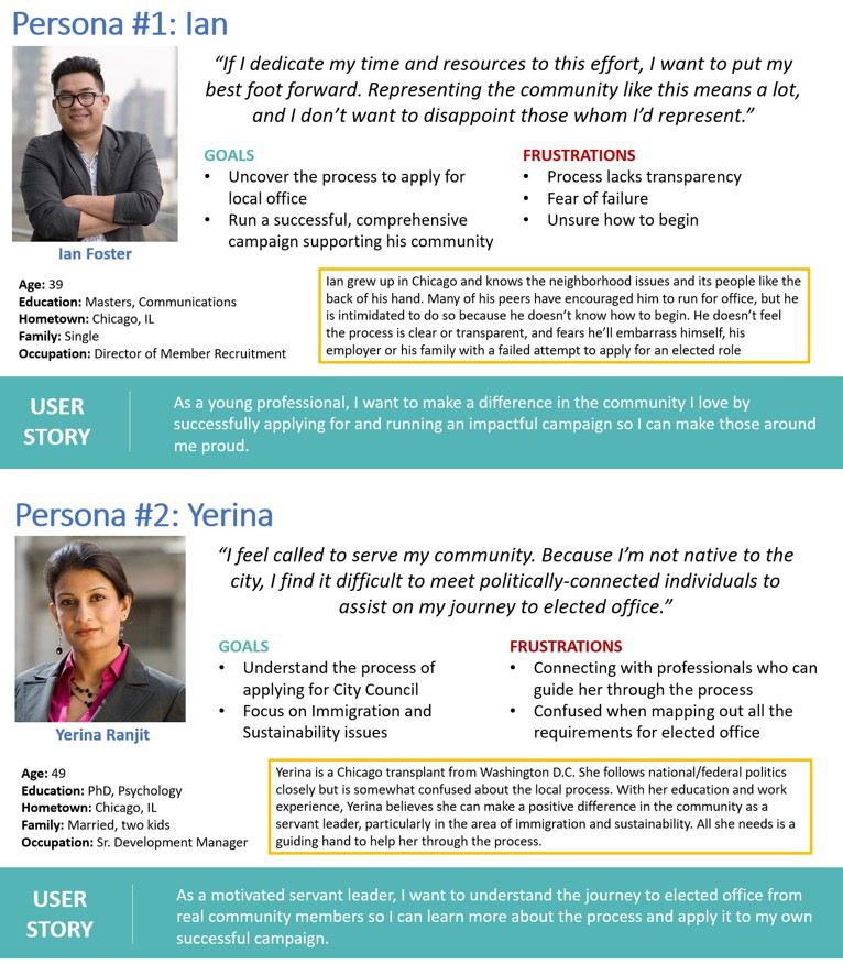
Using a Design Thinking approach, I reached out to potential users and community members to better understand their needs and pain points. Those conversations helped me empathize and develop two personas representing the target user for the My City Campaign app.
Personas in-hand, I was able to complete an aggregated empathy map and begin on the user journey through the user experience. Specifically, I wanted to map out the actual process a user would take to run for local office - from registering as a legal voter to assembling a team for an election campaign.
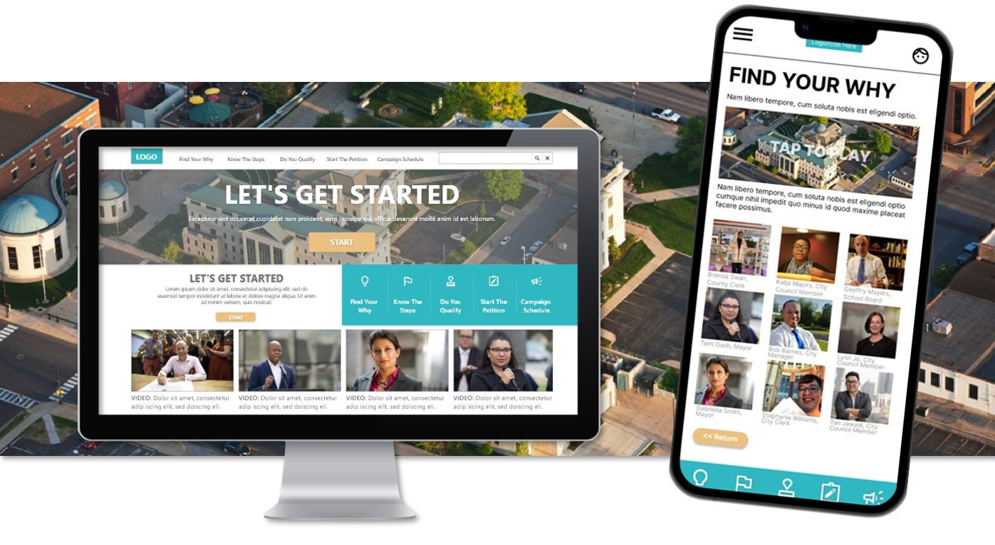
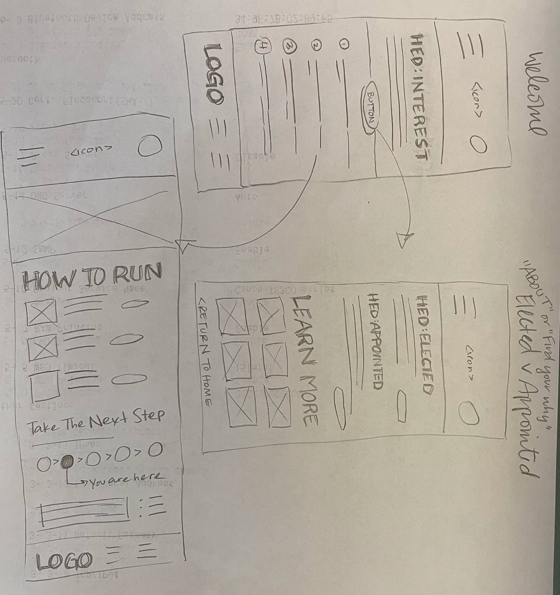
With a process established, I entered the ideation phase ready to make design decisions for this dedicated mobile app experience. Pencil sketches were created before leveraging the power of Figma to outline what the app might look like as a low-fidelity prototype.
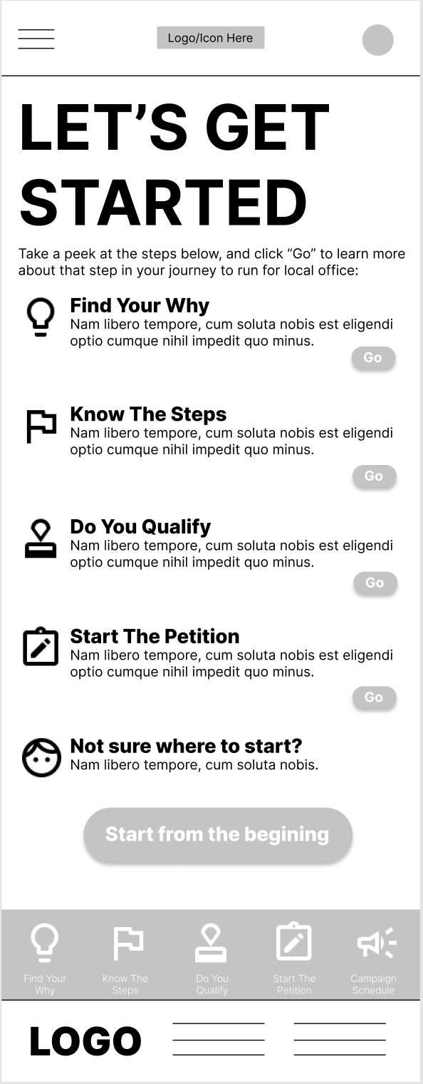
Revised opening screen with targeted entry points.
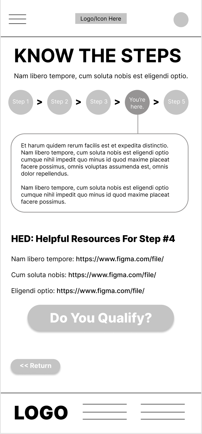
Including helpful resources in new workflow.
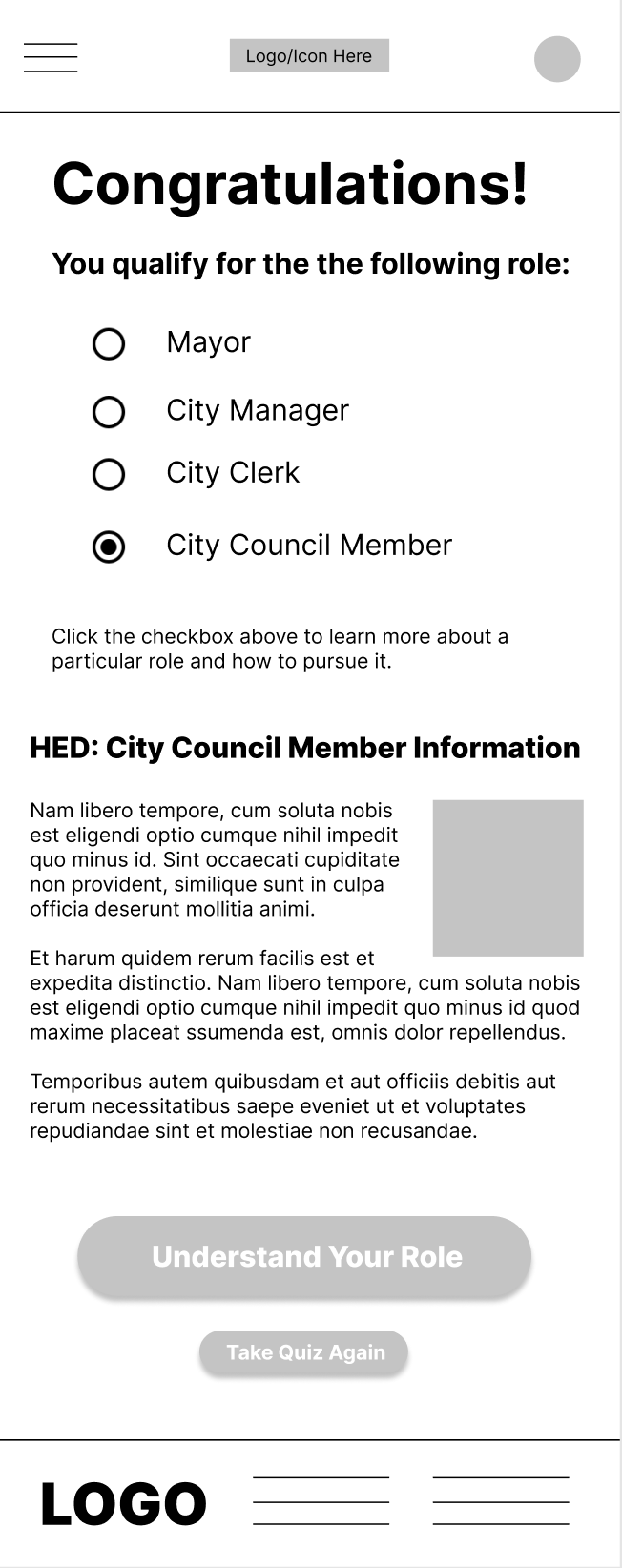
Updated results screen based on user feedback.
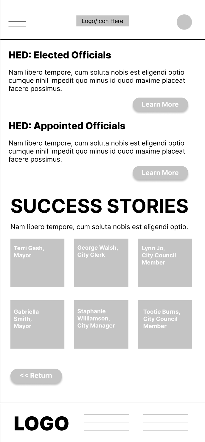
Enhancing value by adding success stories, testimonials section to mobile design.
USABILITY STUDY #1
I gathered five participants for this usability study, all varying in race, gender, and interest in public office. Other than general usability, participants in this research study focused on three simple tasks.
1. Navigate the "Know The Steps" workflow.
2. Successfully complete the "Do You Qualify" quiz.
3. Enhance user value for the "Find Your Why" section.
Users were asked to perform these tasks within a low-fidelity prototype in Figma low-fidelity wireframe in Figma and provide feedback. I synthesized the user feedback they provided and came up with distinct themes and insights for my high-fidelity prototype design. Click here to read the full report.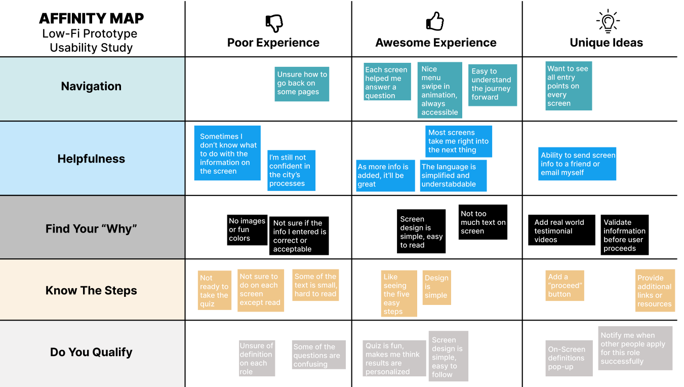
USABILITY STUDY #2
With the feedback from the initial usability study in-hand, I began to incorporate all relevant insights into my high-fidelity prototype for the mobile app experience. From there, the responsive website was developed with the same themes, color schemes and functionality. The website screen format is clearly different than that of a smaller mobile screen, and I enjoyed stretching out the design elements for that experience, as well.
Once the website prototype was in good shape and the key user workflows were completely fleshed out, I executed one last research task - a usability study to validate the web experience and compare feedback to the initial usability study in terms of ease and accessibility. While more informal, the three participants indicated the experience met expectations, workflows were easy to complete, and they all walked away with a better understanding of how to navigate the local political election process.
Check out the embedded website prototype below, which was used in this study.