PROJECT: Workshop Scheduling App for Local Artists ROLE: Concept, Research, Visuals DURATION: 6 months
PROJECT VISION
Book'N Art is an app that gives artists a platform to easily grow their business at a local level. Some event promotion services are inaccessible to artists due to price, technical limitations or are too broad to truly tap into smaller communities. Artists need to effectively promote and collect funds for classes, which can add credibility, legitimacy, and success to their small business. Book'N Art makes it easy to promote and sell artist workshop classes online with little overhead.
CHALLENGES
1. Identify the biggest barriers to event promotion and registration
2. Understand abilities of target audience, as well as technical expertise
3. Prioritize the most important elements of an art event listing for MVP
4. Help local artists share their craft and turn a profit with classes
KICKOFF
In order to better understand the problem, I prepared some initial questions that were later cleaned up and included in an interview protocol for user testing. Using a Design Thinking approach, I tried to visualize the issues or distractions that a user - both an event host and an attendee - might encounter that would impact their ability to search for, create or attend a new local art event. While I came up with multiple ideas, it was clear I needed to learn more about the end user, as well as other competitive mobile event platforms in the marketplace.
COMPETITIVE ANALYSIS
Instead of only measuring the in-app capabilities of competitors in the market, the approach included a deep look at specific elements and features that would be valuable for usability and marketability to a local host. Additionally, I considered some of those same elements might aide an attendee in finding a class that would provide an exceptional local experience.
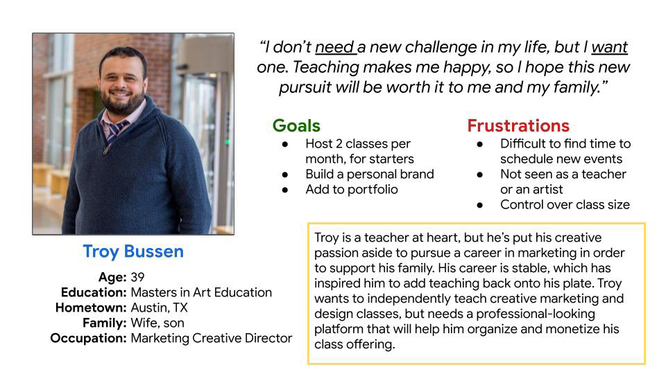
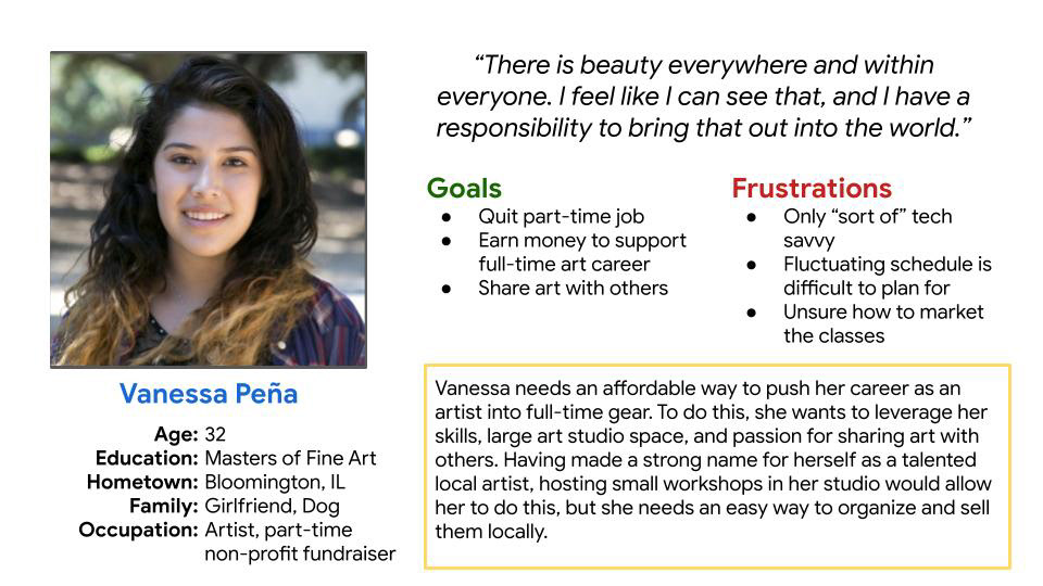
USER PERSONAS
So who would be utilizing this platform, anyway? What kinds of people are trying to grow their business locally by hosting small-batch art events and workshops? After talking to several local artists and small businesspeople, two personas were developed and leveraged throughout the project.
User story.


USABILITY STUDY
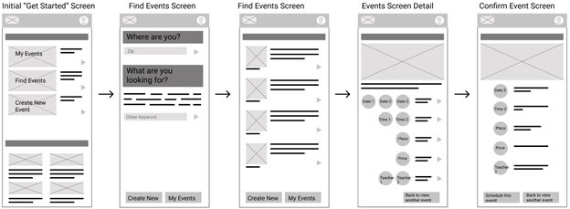
Starting with a simple paper storyboard, I went to task mapping out different workflows for processes, such as creating an event, finding an event, registering for an event, etc. With a solid understanding of who the app needs to work for with the user personas, I translated the paper storyboard into a low-fidelity wireframe in Figma. Here I began to outline the processes and desired functionality within the app. These wireframes were created and shared with a group of five target users in a usability study. Each study participant had varying ages, genders, abilities and backgrounds; however, all had a similar need for growing their business utilizing a mobile event app.

PRIORITIZATION
Aggregated affinity map based on user feedback to aid in prioritization exercise.
After identifying the main themes from the user research, it was clear the type of functionality the user truly needed and wanted in an event app of this type. Those themes were turned into insights, which were later prioritized for the next phase of the design. Key insights include (in priority order):
1. Event hosts need to preview events before publishing them.
2. Provide reassurance to users when event posts successfully, correctly.
3. Event hosts need to sync the app events with their existing calendars for maximum usability.
4. The app should visually guide users through each step of the event creation process.
5. Event hosts prefer to customize what audiences are targeted locally for promo.
6. Users desire push notifications if/when guests interact with the event in any way.
Click here to read the full usability report with prioritized features.
INTERACTIVE PROTOTYPING
Taking the insights learned from the usability study, I made the prioritized adjustments to the design. Most significantly was the process of scheduling a new workshop, which was almost entirely reimagined based on user feedback. In order to give users the confidence to post when their new workshop, I leaned on new design elements to simplify the design and hopefully make it easier to progress through each step successfully. Additional research was done to reference competitor products to understand how their complementary workflows functioned, as well as what design elements they used throughout. Finally, a high-fidelity prototype was created in Figma.
Check out the interactive prototype of this mobile app embedded below.